
The Album Cover as Art: Design, Symbolism, and the Visual Language of Music
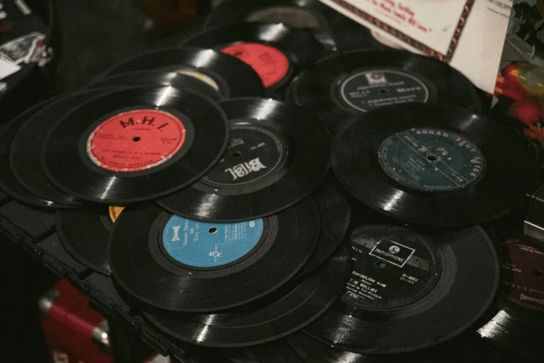
For most of the twentieth century, an album cover was often the first thing a listener experienced before a single note played, a piece of visual communication that had to convey mood, genre, and identity in the space of a square sleeve roughly a foot wide. What began as plain studio photography on early LP jackets grew, over a few decades, into one of the most inventive and widely discussed visual art forms connected to popular culture. This piece traces the history of album cover design, the techniques and movements that shaped it, and why it remains a significant subject of design and cultural history even in an era when most listeners never hold a physical sleeve at all.
From Plain Jackets to Deliberate Design
The earliest long-playing record sleeves, introduced in the late 1940s and through the 1950s, were largely functional: a photograph of the performer, the title, and basic label branding, often following a template used across an entire catalog. As the LP format matured and labels recognized that cover art could influence a buyer browsing bins in a record shop, design began to receive more serious investment. Jazz labels were particularly influential in this shift, with art directors treating cover design as an extension of the music’s identity rather than an afterthought, using bold typography, abstract photography, and carefully chosen color palettes to distinguish releases from competitors on crowded shelves.
The 1960s: Covers as Cultural Statements
By the mid-1960s, album covers had begun to function as cultural statements in their own right, closely tied to the album’s growing status as a unified artistic work rather than a simple collection of singles. Rock and pop acts increasingly used cover art to signal thematic ambition, visual experimentation, or a deliberate break from previous releases. Pop art’s influence on album design during this period, including collage techniques and bold commercial-style imagery, reflected a broader conversation happening in fine art about consumer culture and mass reproduction, and album covers became one of the most visible places where that conversation reached a mainstream audience.
The 1970s: Concept, Symbolism, and the Design Studio
The 1970s are widely considered the high-water mark of album cover art as an independent creative discipline, driven in large part by the rise of dedicated design studios working closely with rock bands. The British design group Hipgnosis, founded by Storm Thorgerson and Aubrey Powell, became known for surreal, conceptually driven imagery built around elaborate photographic staging rather than straightforward portraiture, producing work for numerous prominent rock acts of the era. Gatefold sleeves, which unfolded to roughly twice the size of a standard cover, gave designers considerably more physical space to build immersive visual concepts, often incorporating inner artwork, lyric sheets, or additional imagery that extended the themes of the music itself. This period also saw graphic designers like Peter Saville, working with the Manchester label Factory Records, bring a minimalist, typographically driven sensibility that stood in deliberate contrast to the more elaborate photographic work happening elsewhere in rock.
Many design historians consider the 1970s gatefold sleeve the closest popular music ever came to treating packaging itself as a gallery-scale artwork, built to be unfolded, studied, and returned to long after the record had finished playing.
Fine Artists Crossing into Album Design
Album covers also became a meeting point between popular music and the fine art world, as established visual artists occasionally took on commissions to design sleeves for major recording acts. Andy Warhol, already a central figure in American pop art, designed several well-known album covers during the 1960s and 1970s, applying techniques associated with his broader body of work, including screen printing and playful use of commercial imagery, to the record sleeve format. Illustrators and cartoonists connected to the underground comix movement also found work designing covers for blues and rock acts, bringing a hand-drawn, countercultural sensibility that stood apart from both polished studio photography and later punk minimalism. These crossovers helped establish album art as a legitimate line item in serious design and art history survey courses, rather than a purely commercial afterthought.
Punk’s Deliberate Rejection of Polish
Where 1970s progressive and art rock favored elaborate, often expensive studio production, the punk movement that emerged later in the decade pushed cover design in the opposite direction. Cut-and-paste collage, ransom-note lettering, photocopied textures, and deliberately rough, low-budget visuals became a style in their own right, closely tied to punk’s broader rejection of music-industry polish and its do-it-yourself ethos, a connection explored further in writing on how punk rock challenged the conventions of the record business. This aesthetic proved just as influential as the lavish design movements it reacted against, shaping zine culture, flyer design, and independent label packaging for decades afterward.
Censorship, Controversy, and Commerce
Album covers have periodically become flashpoints for controversy, with retailers and labels occasionally altering or banning artwork deemed too explicit, violent, or politically provocative for mainstream distribution. These disputes highlight how seriously both audiences and institutions have taken cover art as meaningful communication rather than disposable packaging. At the same time, iconic covers became valuable commercial assets in their own right, reproduced on posters, t-shirts, and later digital merchandise, extending an album’s visual identity far beyond the format it was originally designed for and reinforcing the broader pattern discussed in coverage of the album’s rise as a serious artistic format.
From the Record Store Wall to the Digital Thumbnail
For decades, cover art played a direct role in how listeners discovered new music, since striking artwork could draw attention in the environment examined in writing on how fans browsed and discovered records in physical stores. The arrival of music video and later digital formats changed how audiences encountered visual branding tied to artists, a shift traced in coverage of how music video reshaped the industry’s visual culture. Streaming has since reduced most cover art to a small thumbnail glimpsed briefly on a screen, yet the continued popularity of vinyl reissues and deluxe packaging suggests that physical album art retains real cultural and collectible value for a dedicated segment of listeners.
Museums and design institutions have increasingly treated this history as worthy of formal preservation, mounting exhibitions dedicated to album art and acquiring notable sleeves for permanent collections. Graphic design programs regularly cite landmark covers from the 1960s and 1970s as teaching examples of how commercial constraints, limited budgets, and a small square format could still produce lasting creative work. That institutional recognition reinforces what generations of record buyers already understood instinctively: that the image wrapped around a record was never merely packaging, but an inseparable part of how the music was first encountered and remembered.
Historical Context
Album cover design matured alongside the LP itself, moving from functional 1950s packaging to the conceptually ambitious work of the 1970s, when gatefold sleeves and dedicated design studios had become standard practice among major rock acts. This period overlapped directly with the album’s broader transformation into a unified artistic statement rather than a collection of singles. The punk and independent label movements of the late 1970s and early 1980s then deliberately reacted against that elaborate aesthetic, favoring cheaper, faster, more confrontational visual methods.
Sources & Further Reading
- Design history surveys and museum retrospectives on album cover art
- Interviews and retrospectives on design studios such as Hipgnosis and Factory Records’ in-house designers
- Music journalism coverage of notable album artwork controversies
- Record label and reissue liner notes documenting original design credits
- General histories of graphic design and twentieth-century commercial art